Every September I've got a run of bridal trials back to back, and the invitation suite is usually sitting on the counter right next to my color swatches while we talk. I'm a colorist, not a stationer, but color and texture are literally my job, and I've noticed the brides whose invites and hair actually feel like the same wedding tend to have thought about palette early, not last. Here are five boho suites I keep seeing come through my chair, and what I'd tell a client about each one.
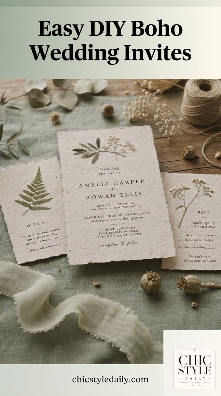
The Pressed Botanical on Handmade Deckled Paper
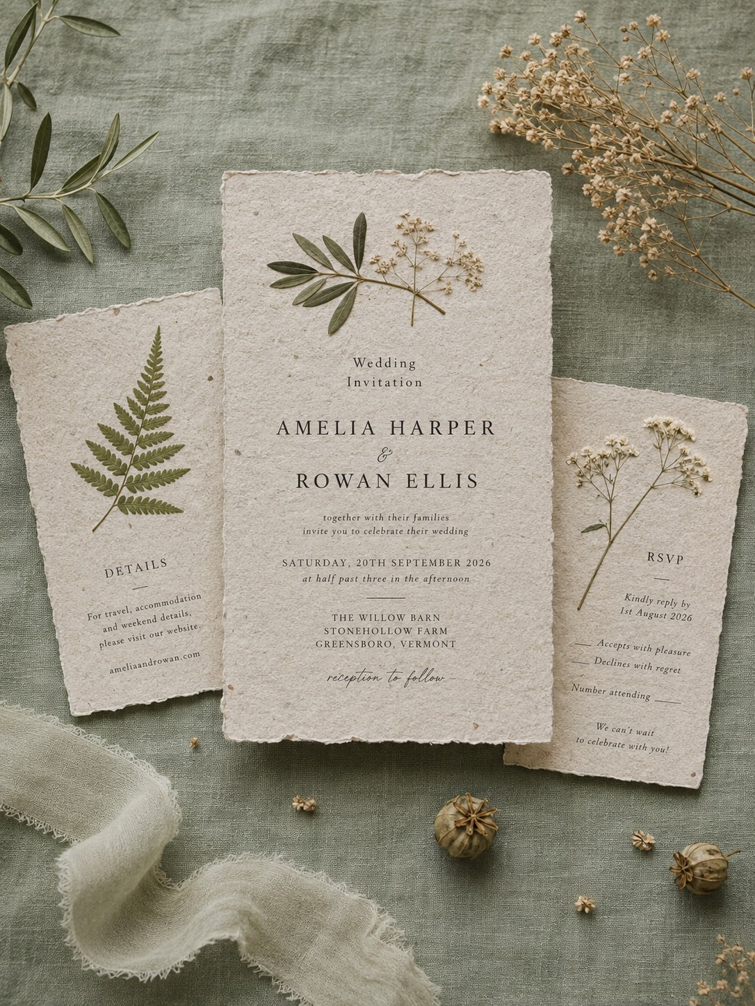
This is the suite I point to when a bride says she wants boho but not 'crunchy.' The uneven, torn deckled edge and the visible fiber in cotton rag paper do the heavy lifting — you get texture without a single loud color. The fern and dried baby's-breath sprigs are usually line-illustrated or actually pressed, printed in a single muted green ink against a warm putty background.
- Best for: barn and farm venues, autumn dates, anyone whose whole aesthetic leans neutral and layered rather than colorful.
- Personalize it: swap the fern for whatever grows near your venue — olive if you're coastal, eucalyptus if you're not near either.
- Real numbers: handmade deckled paper suites typically run $8 to $14 per invitation and need six to eight weeks of production, longer if you want letterpress instead of digital print.
The one thing I'd flag from the color side: sage and putty read differently under warm venue lighting than they do on your screen, so if this palette matters to you, ask for a printed sample, not a digital proof.
The Warm Watercolor Bloom, Full Bleed
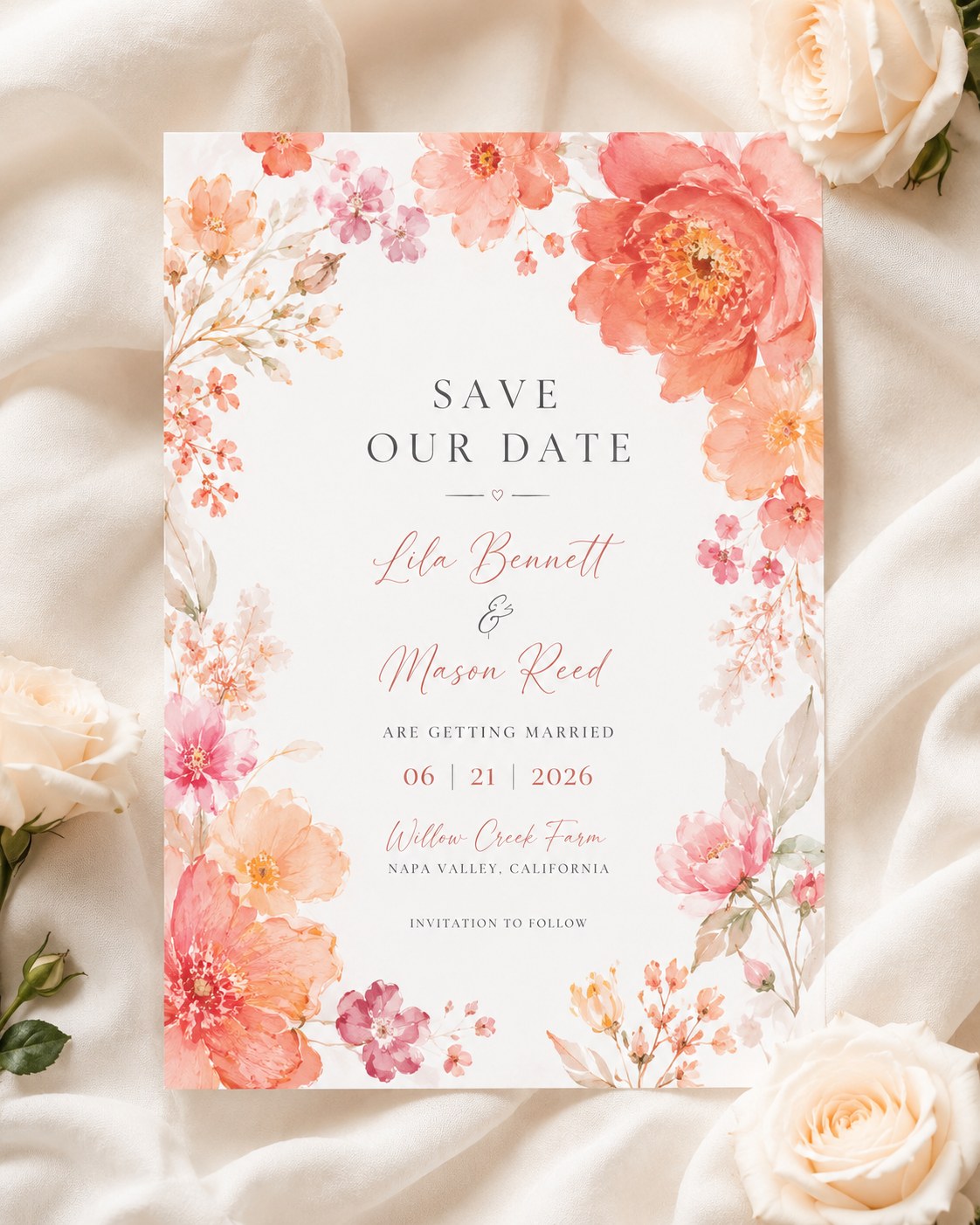
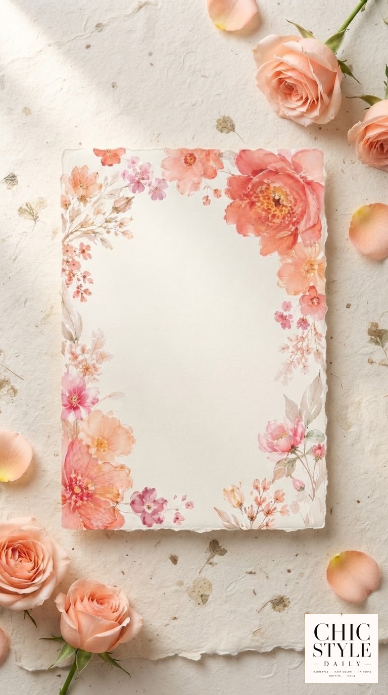
Where the first design whispers, this one talks. Full-bleed watercolor florals in coral, blush and burnt orange wrap the entire card edge to edge, usually peony and ranunculus painted loose and layered rather than botanically precise. It's boho with volume — the kind of piece that photographs beautifully on a flat lay next to real flowers because it's basically already a bouquet.
This works best as a save the date more than a full invitation, and that's intentional in the design world — a bold, saturated piece does its job in the mailbox in three seconds, which is exactly what a save the date needs to do.
- Whom it flatters: vineyard, garden or greenhouse weddings, warm-season dates, brides who want their stationery to feel like an event, not a formality.
- Budget and timing: semi-custom templates run $2 to $4 per printed card; get these ordered and mailed six to eight months out so the color and the date land together.
The Wildflower Wreath Frame
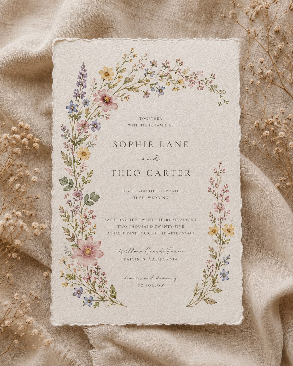
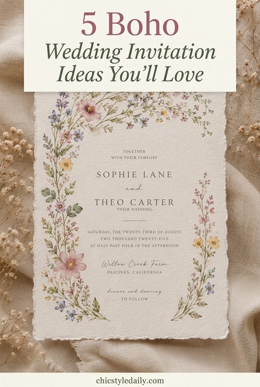
Instead of florals stacked in one corner, this suite frames the entire text block in a loose ring of mixed wildflowers — lavender, dusty pink, buttery yellow, a little blue thrown in for contrast. It's the busiest palette on this list in terms of hue count, but it never reads chaotic because everything sits at the same soft, watercolor saturation.
I tell clients the same thing about a mixed floral wreath that I tell them about a multi-tonal balayage: it works because nothing is fighting to be the loudest color in the room.
The deckled edge and stone-colored background keep it grounded, which is why it suits a ranch or vineyard as easily as a backyard. If you want to adapt it, ask your stationer to lean the wreath's palette warmer or cooler to match your actual florals rather than approving a generic template — a wreath that echoes your real bouquet colors reads intentional instead of decorative.
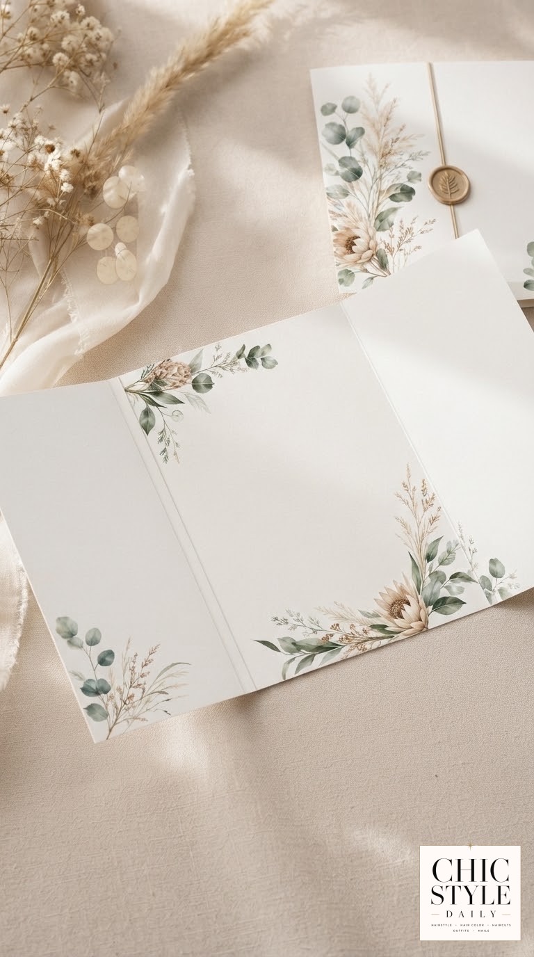
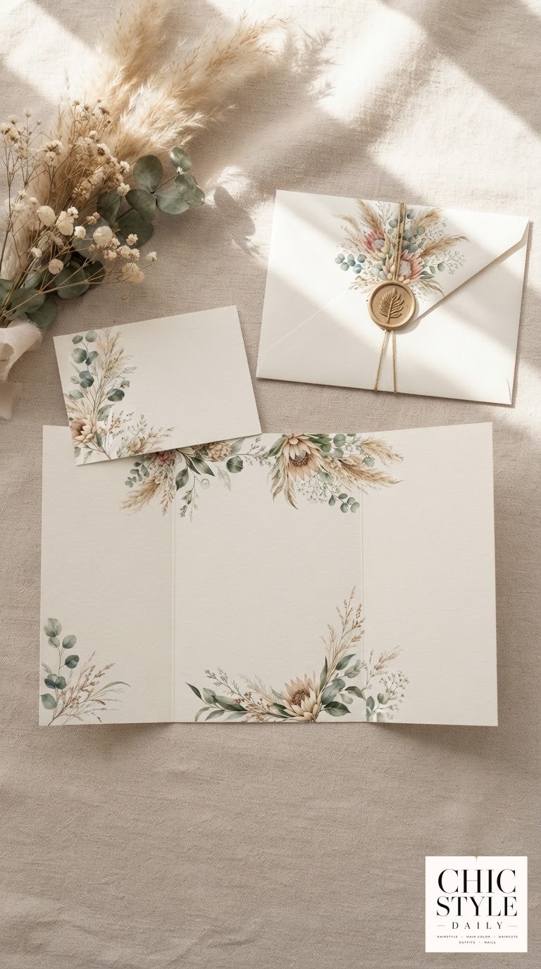
The Gatefold Suite with Wax Seal
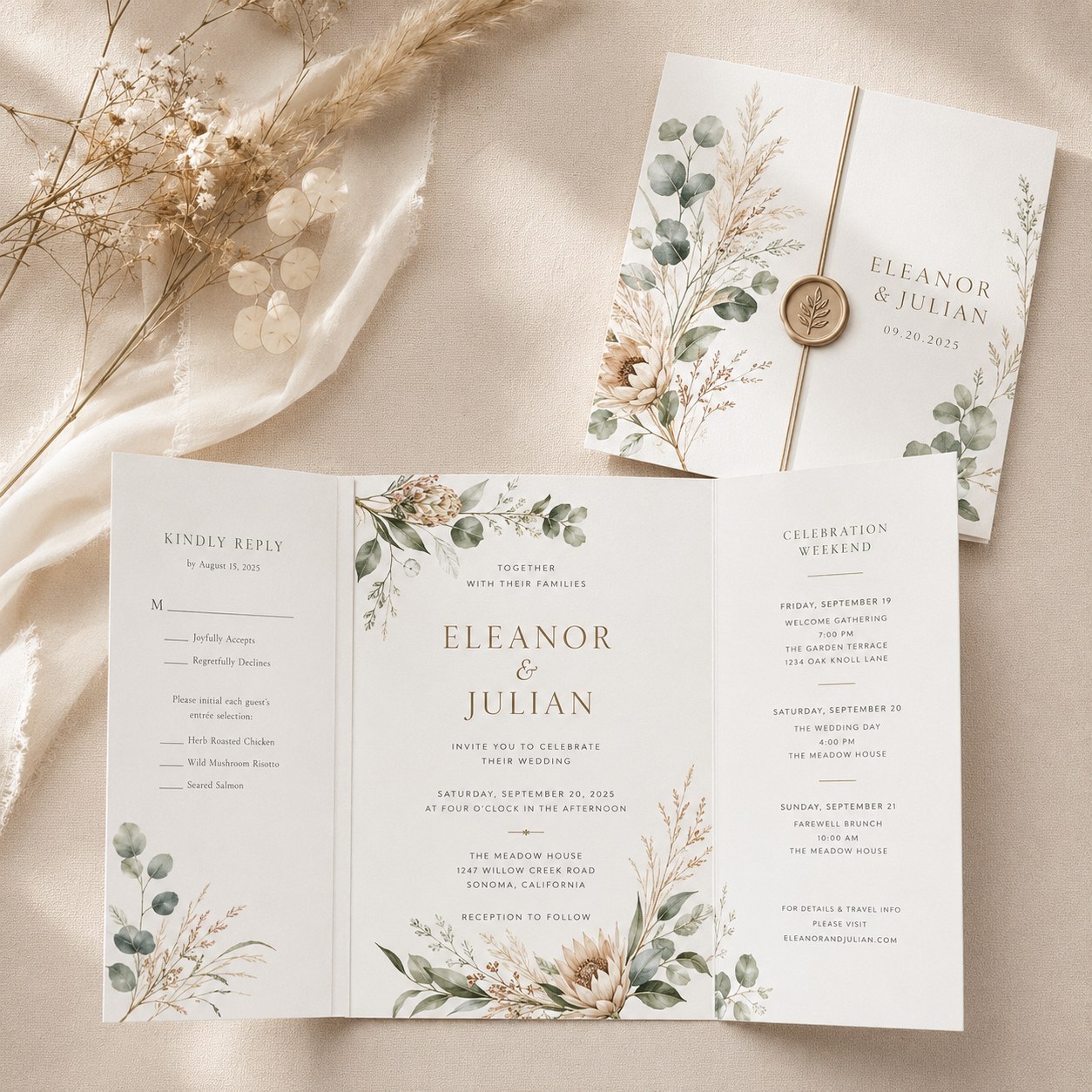
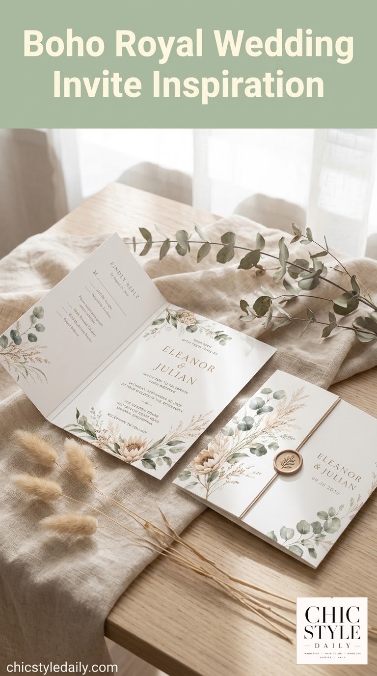
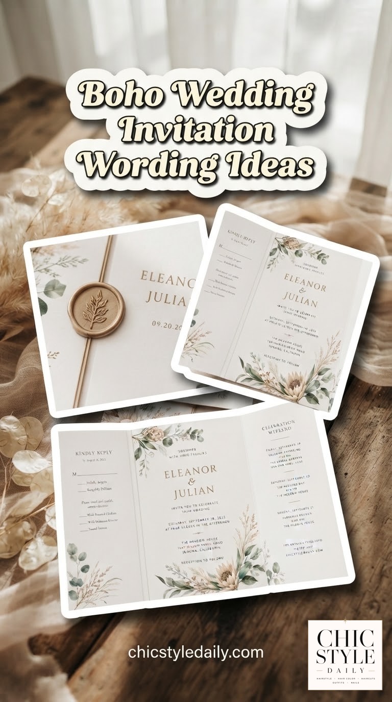
This is the design for a weekend wedding, not a single-day one. The gatefold format opens like a little book — RSVP card on one side, the details and celebration weekend itinerary on the other, all wrapped in a cover dressed with eucalyptus and pampas grass and closed with twine and a wax seal.
Why it earns its extra cost
- It solves a real problem — multi-event weekends (welcome gathering, ceremony, farewell brunch) need somewhere to put all that information without three separate insert cards.
- It's genuinely hand-assembled — the seal, the twine, the folding are done by hand, which is why gatefold suites run $10 to $18 a piece.
- Order it early — that assembly labor means longer turnaround, so build in extra weeks beyond a standard flat invitation.
If pampas grass isn't available or in season near your printer, ask to swap in more eucalyptus — the greenery still carries the same relaxed, gathered-from-the-garden feeling.
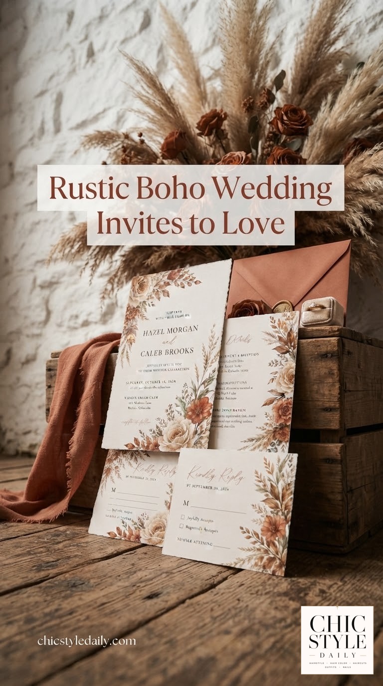
The Rust and Terracotta Autumn Suite
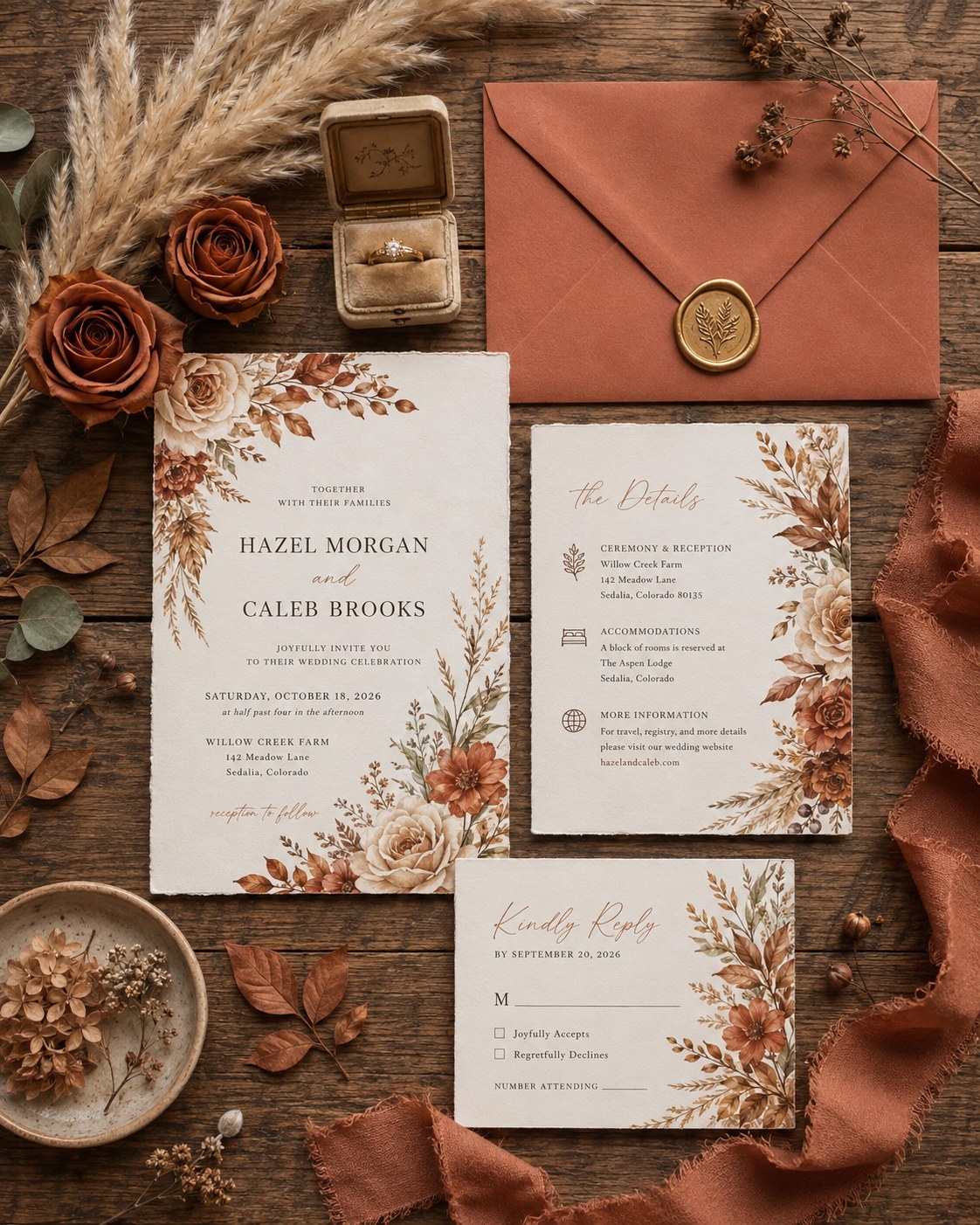
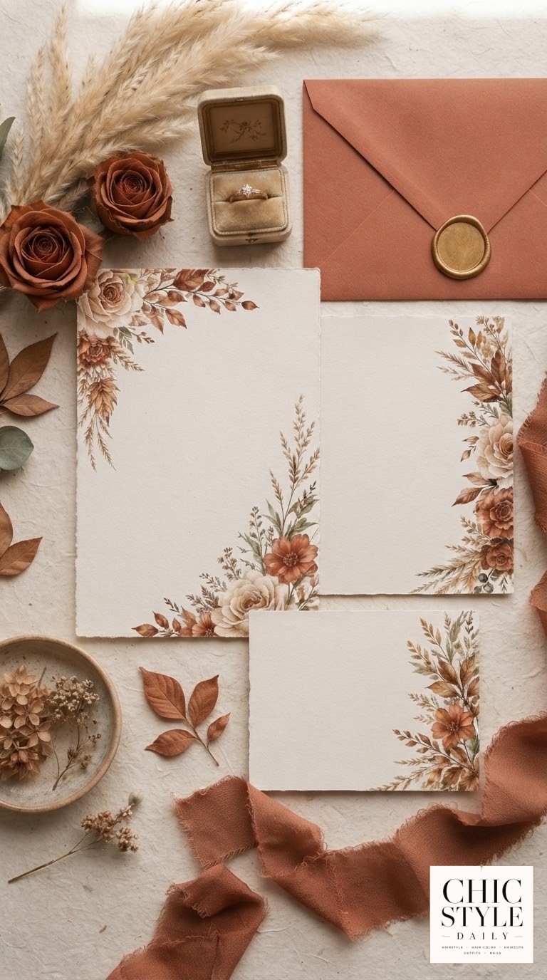
Warm rust, burnt orange and terracotta florals against cream card stock, paired with a rust-colored envelope and a botanical wax seal — this is boho leaning into fall on purpose, dried pampas grass and all. It's the palette I'd genuinely recommend to any bride who's warm-toned, and I say that as someone who's spent nine years matching hair color to skin undertone: if you're a copper, auburn or strawberry blonde bride, this suite will photograph like it was built around your hair color, because rust and copper share the same warm base.
It suits October ranch or barn weddings especially well, where the invitation can echo the actual dried florals in the centerpieces rather than just referencing autumn generically.
- Adapt it: match the wax seal color to your ring box or venue accents rather than defaulting to gold.
- Cost note: colored envelopes and wax seals add roughly $1 to $2 per piece over a standard white envelope — worth it if it's the only place your accent color shows up before the wedding day.
None of these five need to be copied exactly — pull the paper texture from one, the palette from another, and hand your stationer a reference the way you'd hand me a photo at a consultation. The best invitation is the one that actually looks like your wedding, not someone else's.

Common Questions
How far in advance should I order boho wedding invitations?
For a standard invitation, order eight to twelve weeks before you need to mail them, and add extra time for handmade paper or gatefold formats since those involve hand-assembly. Save the dates should go out six to eight months before the wedding.
Can I mix a deckled-edge paper with a bold, saturated color palette?
Yes, and it's one of my favorite combinations. The rough, organic edge softens a bold palette so it reads boho instead of graphic. Ask for a printed proof, since saturated colors shift more than muted ones between screen and paper.
Do wax seals actually survive being mailed?
Most stationers now use a flexible wax formula that bends instead of cracking in transit, but ask specifically before you order, and consider hand-delivering a few to guests nearby if you're worried about a particularly delicate seal design.