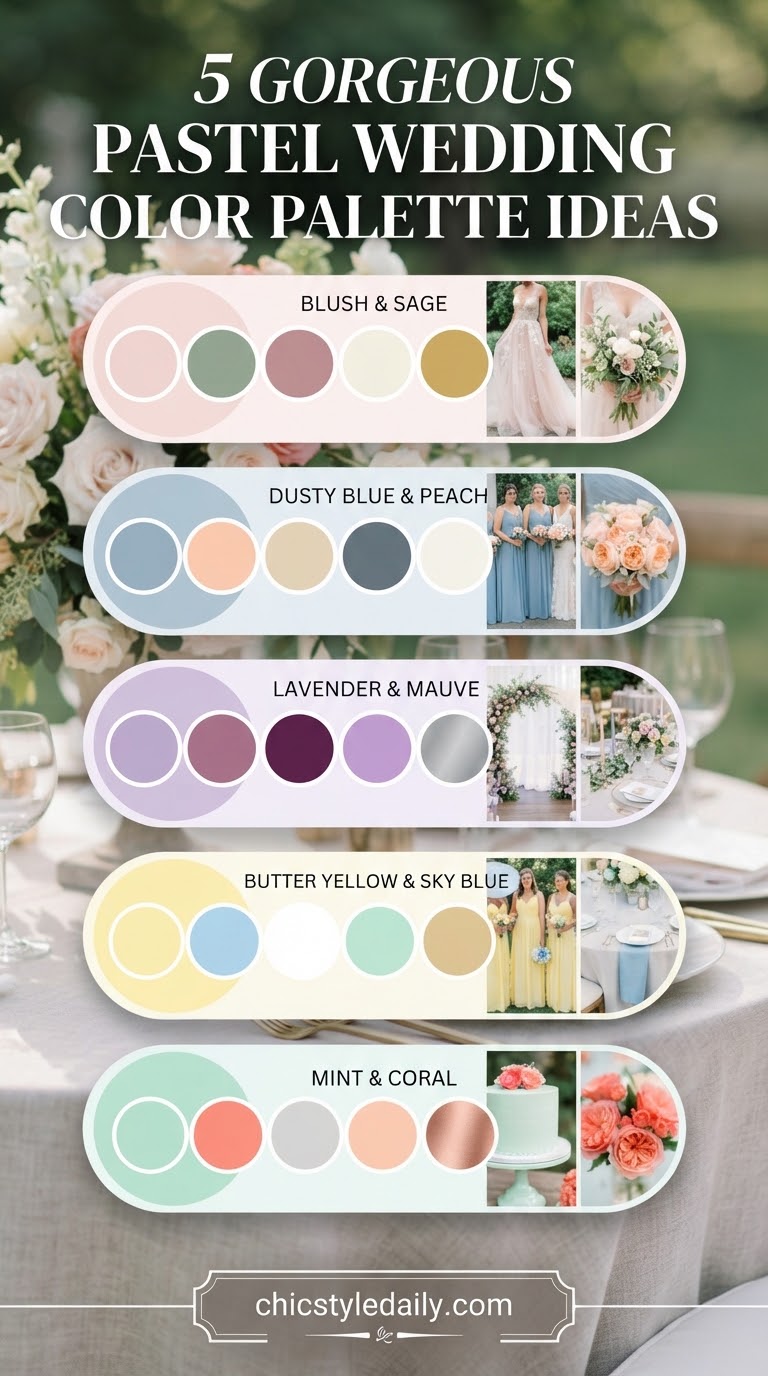
I spend a good chunk of my chair time doing bridal party hair, and the question I get most isn't about a cut or a color — it's a bride holding her phone up asking if her hair will 'go' with the flowers. So when I looked through this pastel wedding color palette 17 set, I wasn't looking at it as a florist would. I was looking at it the way I look at anyone sitting in my chair: what undertones are actually in here, and who does this flatter once real hair and real skin walk into the room.
Dusty Blue Garden Reception
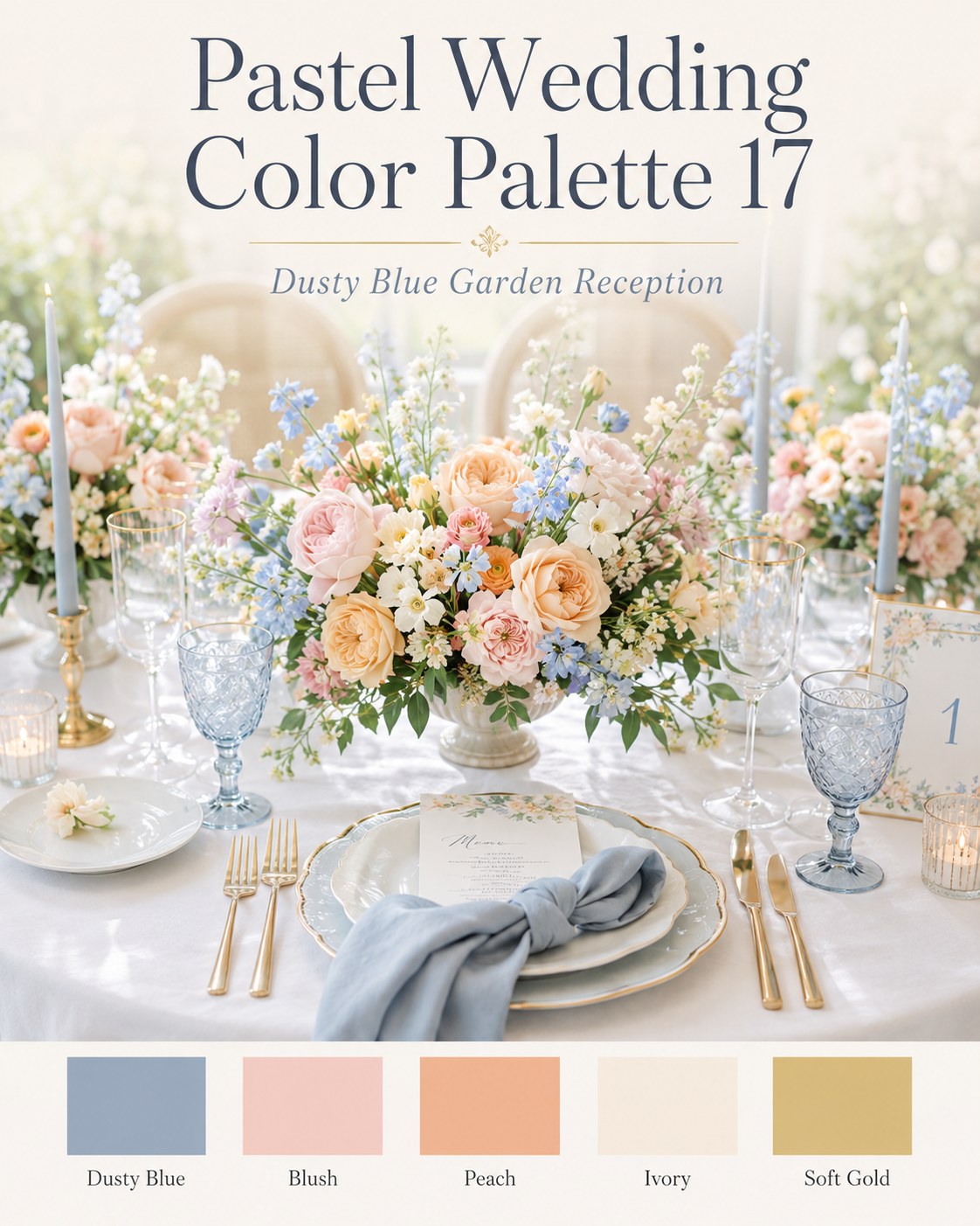
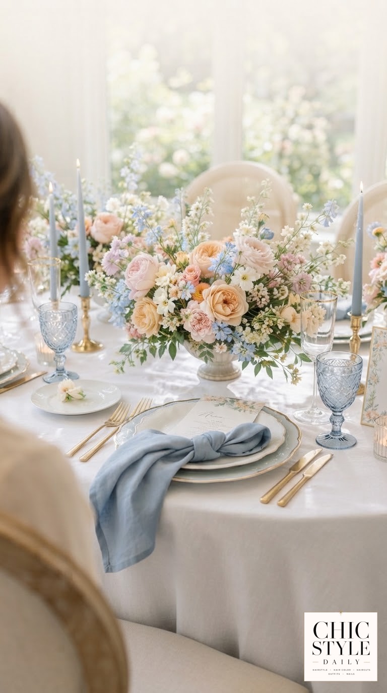
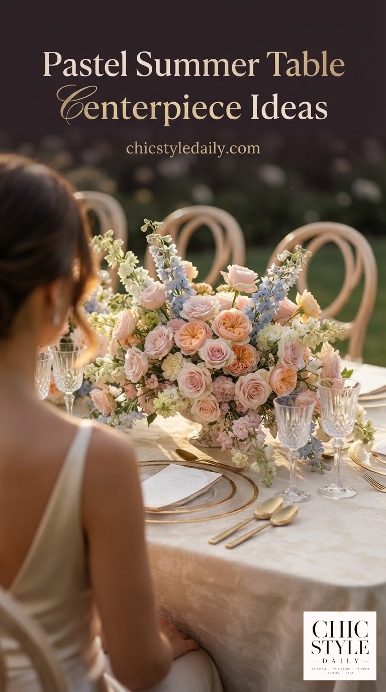
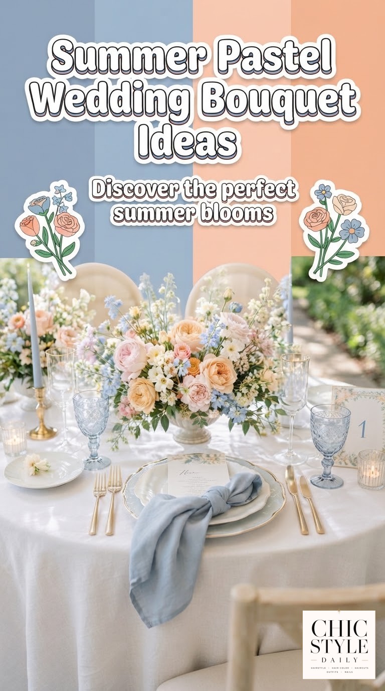
This is the palette I'd point a warm-skinned bride with cool-toned hair toward without a second thought. Dusty blue and soft gold read as an intentional pair rather than an accident, and the blush-to-peach gradient in the florals does the actual heavy lifting — it warms the whole tablescape up so the blue candles and glassware don't feel cold.
Where I get pulled into this one professionally: the gold flatware and soft gold swatch are a gift for strawberry blondes and warm honey brunettes in the bridal party, since gold undertones next to hair with any copper or golden base just look correct. If your bridesmaids run cooler through their hair color, lean their bouquets more toward the ivory and blush end and let the dusty blue stay in the linens and glass rather than anyone's hands.
- Best for: a reception you want to feel garden-elegant, not garden-party-casual
- Watch for: too much dusty blue without the peach warmth reads cold under evening light
- Easy swap: soft gold candles instead of gold flatware if your venue won't allow the metal on rentals
Garden Arch Ceremony
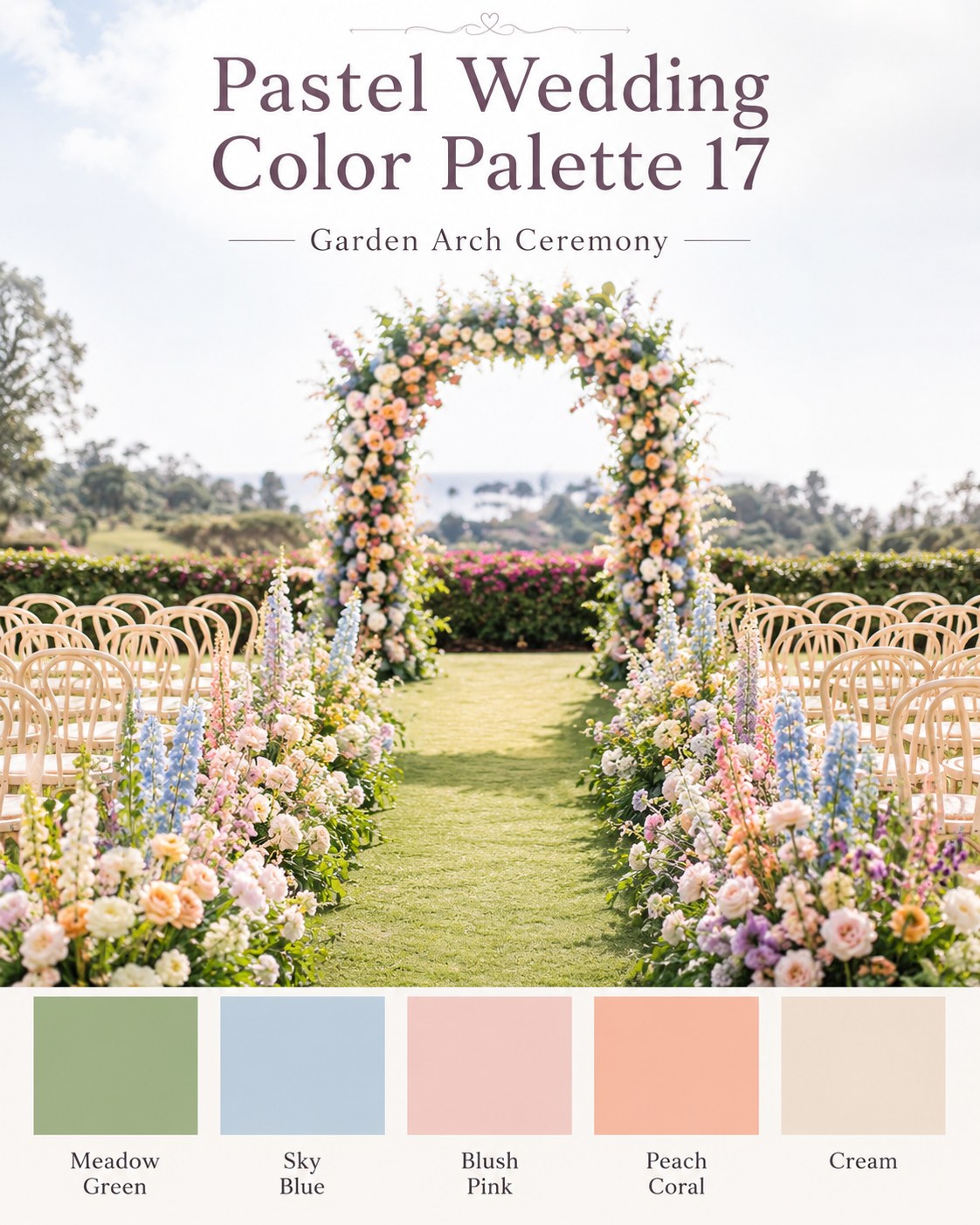
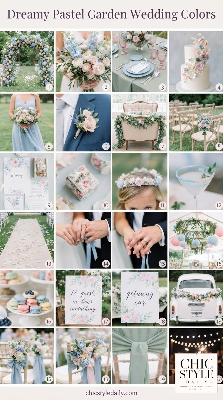
Meadow green is the color that does the most work in this one — it's the reason sky blue, blush pink, and peach coral can sit next to each other without competing. I tell clients this is the palette equivalent of a well-cut curly bob: every element is doing a specific job, nothing is there for decoration alone.
A ceremony arch this dense in florals is genuinely three to five hours of a florist's labor — if your quote comes back low for this look, ask what's actually included before you fall in love with the photo.
For hair, this is the friendliest palette in the set. The green and cream neutralize almost every hair color I put in a chair — grey-blended brunettes, box-dye red, natural curl left alone — because there's no single dominant hue fighting for attention. If I had a bride ask what to tell her stylist for this one, it's simple: soft, undone waves or an easy low bun, nothing structured, because the arch and aisle are already visually busy.
- Best for: outdoor ceremonies with a water or garden backdrop
- Flatters: nearly every hair color, which makes it the lowest-stress choice for a big bridal party
Sunset Bridal Party
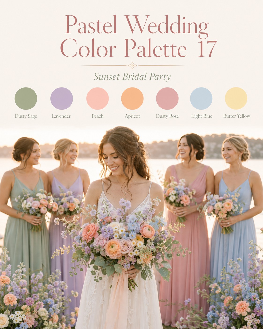
Seven colors is a lot for a bridal party palette, and I'll say the quiet part: this only works because the dresses are mismatched by design, not by accident. Dusty sage, lavender, peach, apricot, dusty rose, light blue, and butter yellow read as a considered gradient rather than chaos because each bridesmaid gets one note instead of the whole chord.
Here's where my chair experience actually matters for this palette: seven different dress tones next to seven different natural hair colors is a coordination problem most brides haven't thought through. I'd tell every bridesmaid the same thing I tell clients before a big event — don't get a fresh, dramatic color change two days before, because color needs a wash cycle or two to settle and stop looking freshly-done under photos. If someone in the party wants a blowout or a color refresh, book it the week before, not the morning of.
- Best for: a bridal party of five or more where everyone wants a say in their dress tone
- Reality check: this many hues needs a bouquet designer who's genuinely styling per-person, not just handing out the same arrangement in different ribbon
Blue Blush Bouquet
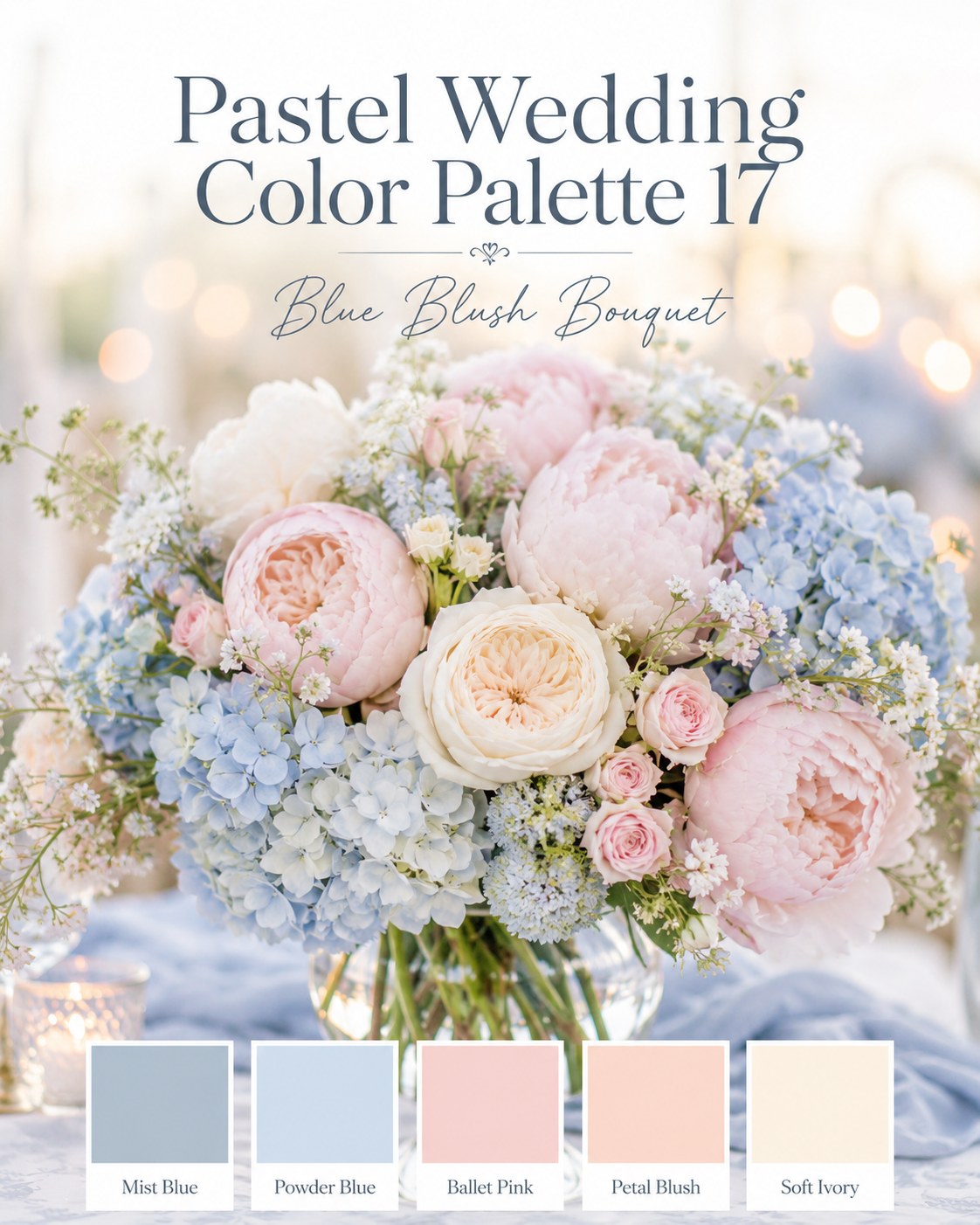
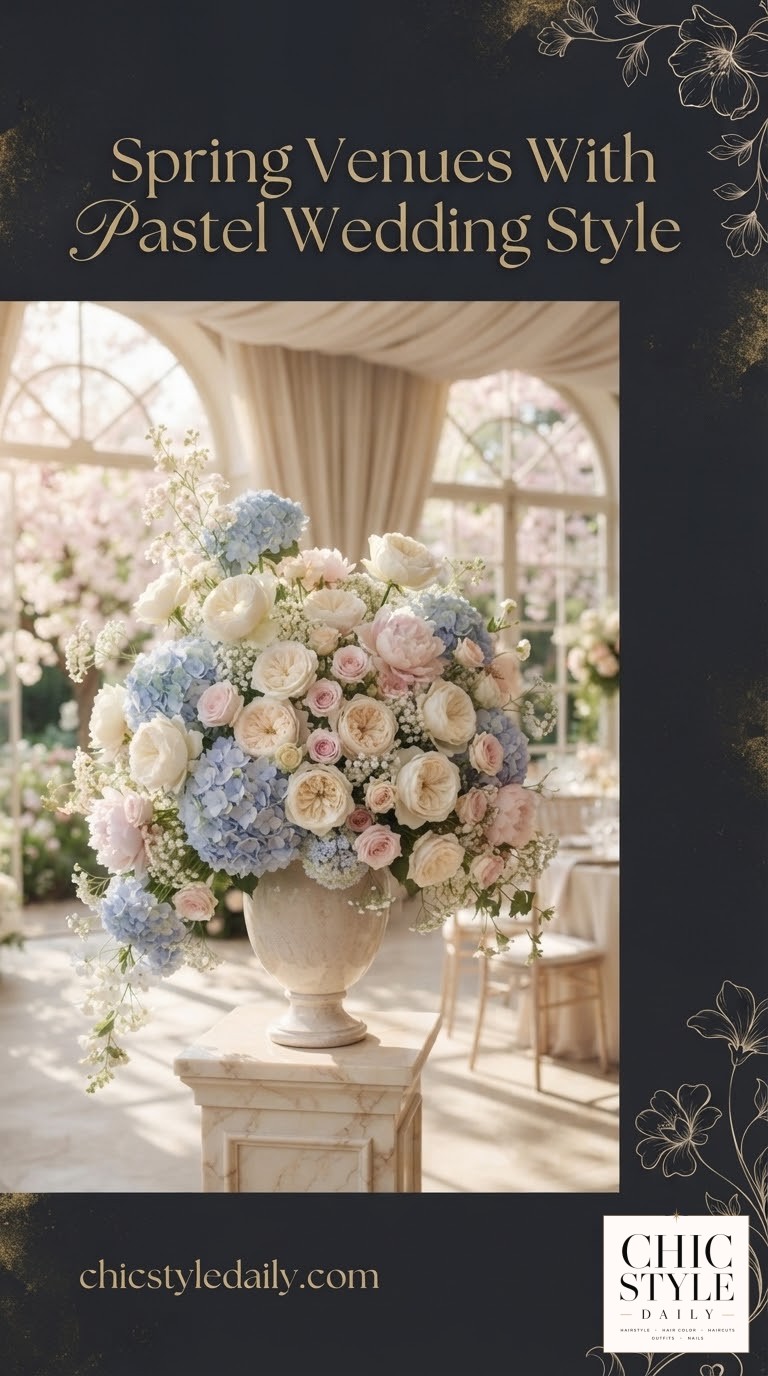
This is the most photographed centerpiece style I see referenced, and for good reason — mist blue and powder blue against ballet pink and petal blush is a genuinely soft, low-contrast combination, which is exactly why it reads as expensive. Low contrast palettes photograph as calm; high contrast palettes photograph as loud. Peonies and hydrangea carry this look because they're both full, soft-edged blooms — nothing spiky or structured breaks the mood.
Who this flatters
Powder and mist blue next to skin with pink undertones is one of the most universally kind pairings I've seen in a season of wedding requests. If you're building this into your day and want your own hair to sit inside the palette rather than fight it, cool-toned blondes and ash brunettes will look like they were dressed to match on purpose. Warmer coppers and golden hair can still absolutely wear this — just balance it with the ivory and blush tones near your face rather than standing directly next to the deepest blue.
- Best for: indoor evening receptions with warm ambient lighting, which softens the blue further
- Swap idea: soft ivory ranunculus if peonies are out of season for your date
Lavender Dessert Garden
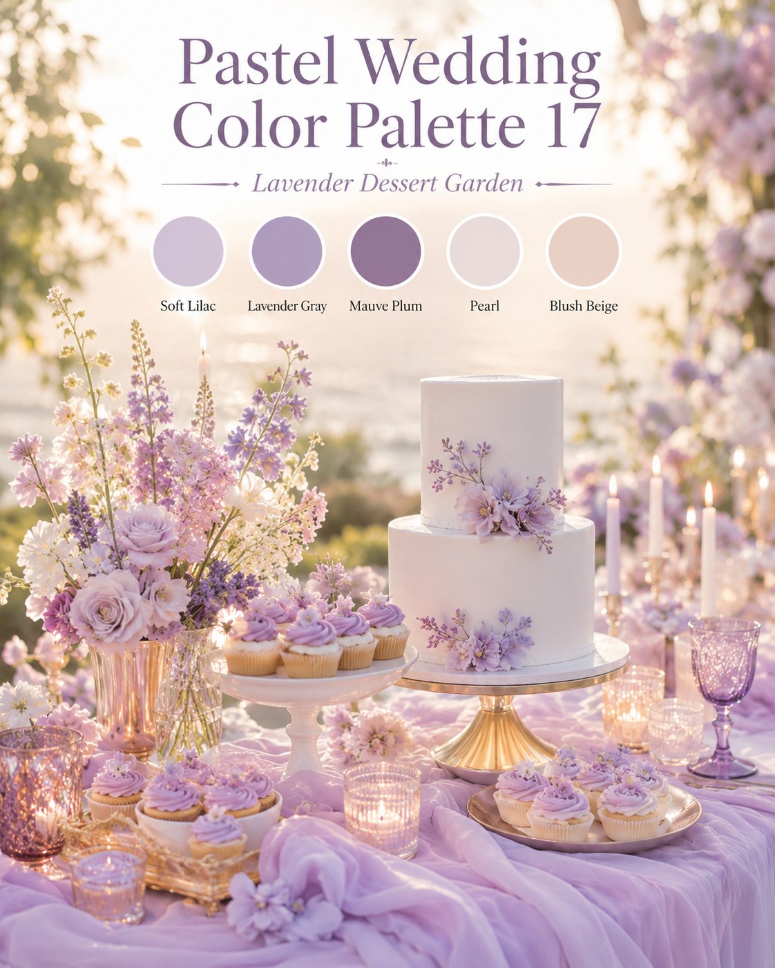
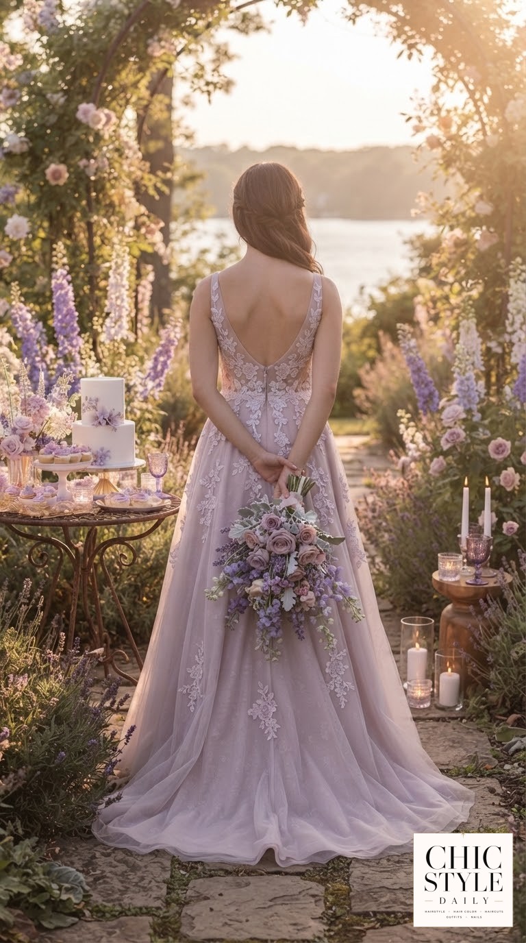
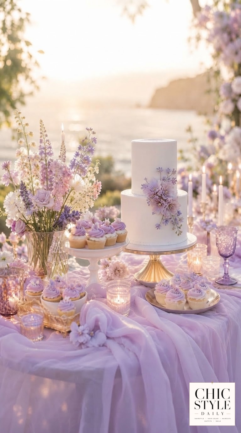
Of all five, this is the palette I'd steer a cool-toned bride with silver or ash-grey hair toward, and it's not a small thing — most wedding palettes are built assuming a warm-skinned, warm-haired bride, and this one genuinely isn't. Soft lilac, lavender gray, and mauve plum against pearl and blush beige is a cool, dusty palette from top to bottom, cake included.
The mauve plum is doing what the meadow green did in the ceremony arch palette — it's the deep anchor color that keeps the lighter lilac and pearl from washing out under evening light. If you're covering grey for the wedding or leaving it, both options sit beautifully in this palette; a silver-blended grow-out actually photographs like it was planned to match.
- Anchor first — pick the mauve plum linens or ribbon before choosing lighter accents
- Keep gold minimal — this palette wants silver or matte gold hardware, not bright brass
- Lighting matters — lavender tones can go slightly grey under harsh overhead light, so candlelight or warm string lights keep it looking soft rather than flat
If I had to pick just one for a bride sitting in my chair asking me to choose, I'd say build backward from whichever palette makes your own coloring and your bridal party's hair look effortless in the photos — the flowers will always be beautiful, but the faces are what everyone actually looks at.

Frequently Asked Questions
Which of these palettes works best with red hair?
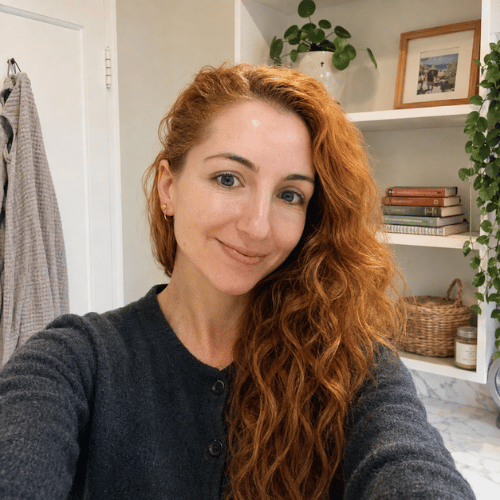
As a redhead myself, I'd point toward the Dusty Blue Garden Reception or Blue Blush Bouquet palettes. Blue tones next to red hair create real contrast that reads intentional rather than clashing, whereas peach-and-apricot-heavy palettes can compete with copper tones instead of complementing them.
Can I mix colors from two of these palettes?
You can, but pick one as your anchor and borrow one accent from the second rather than blending both fully — seven or eight colors across a wedding day gets visually noisy fast, and it makes coordinating hair and dress tones across a bridal party much harder.
Do these pastel palettes work for a fall or winter wedding?
The Lavender Dessert Garden and Sunset Bridal Party palettes translate best out of spring and summer since mauve, plum, and dusty sage already lean toward deeper, moodier tones that hold up under candlelight and cooler-weather styling.