Fall weddings have moved far beyond predictable orange and brown combinations. I love seeing couples choose modern fall wedding colors that feel personal, photograph beautifully, and still make sense when the candles burn down and the season changes.
I approached these palettes the same way I approach hair colour in my chair: the pretty part matters, but the upkeep and real-life setting matter too. A wedding palette should work with your venue, flowers, outfits, and budget instead of becoming another impossible Pinterest project.
Quick palette guide
- Warm neutrals create an effortless luxury feel.
- Deep jewel tones add drama without looking dated.
- Earthy shades pair beautifully with autumn textures.
Champagne Gold & Ivory
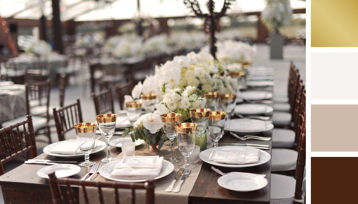
Champagne gold and ivory is one of those combinations that always looks expensive without trying too hard. I love it for couples who want soft autumn elegance rather than a theme that screams seasonal.
This palette works especially well with candlelight, silk fabrics, and warm floral arrangements. For a realistic budget, use gold as an accent rather than buying every detail in metallic finishes.
Terracotta & Blush
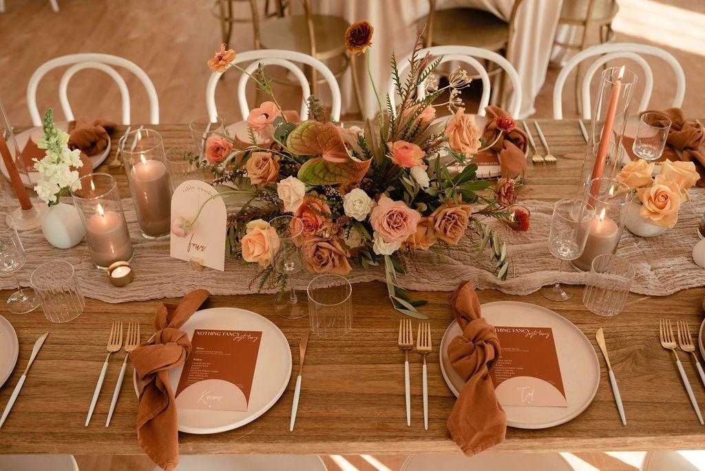
Terracotta and blush feels like autumn through a modern lens. I keep seeing this pairing because it gives warmth while keeping the overall look romantic and fresh.
It is a forgiving palette for flowers because dried grasses, roses, and seasonal foliage naturally sit in this family. Just remember that terracotta can photograph stronger than it appears in person, so test samples before ordering linens.
Burgundy & Dusty Rose
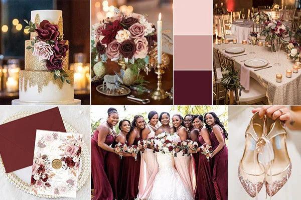
Burgundy and dusty rose is my pick when someone wants a rich fall palette that still feels soft. The contrast between deep wine tones and muted pink creates balanced wedding colours instead of a heavy look.
I would pair this with warm lighting because cool venue lighting can make burgundy appear almost purple. Bring your fabric swatches to your florist and planner so everyone is matching the same version of the shade.
Emerald Green & Gold
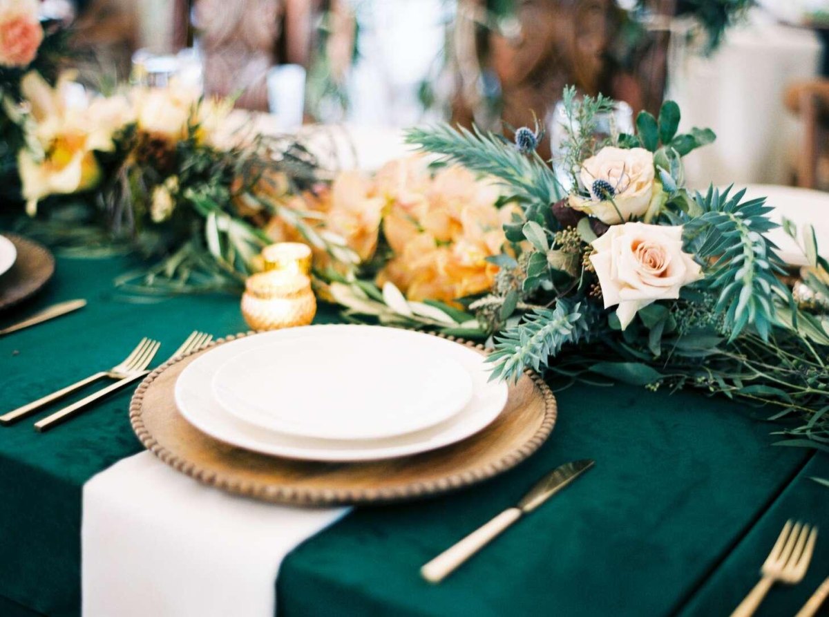
Emerald green and gold has a jewel-box quality that works beautifully for evening celebrations. I like this combination because deep green wedding details feel seasonal without being limited to autumn.
Use greenery carefully, though. Too much foliage can make a reception feel like a garden centre instead of an intentional design choice.
Styling tip
Let emerald be the statement shade and allow gold to highlight smaller details.
Navy & Copper
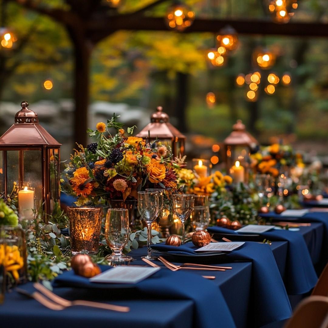
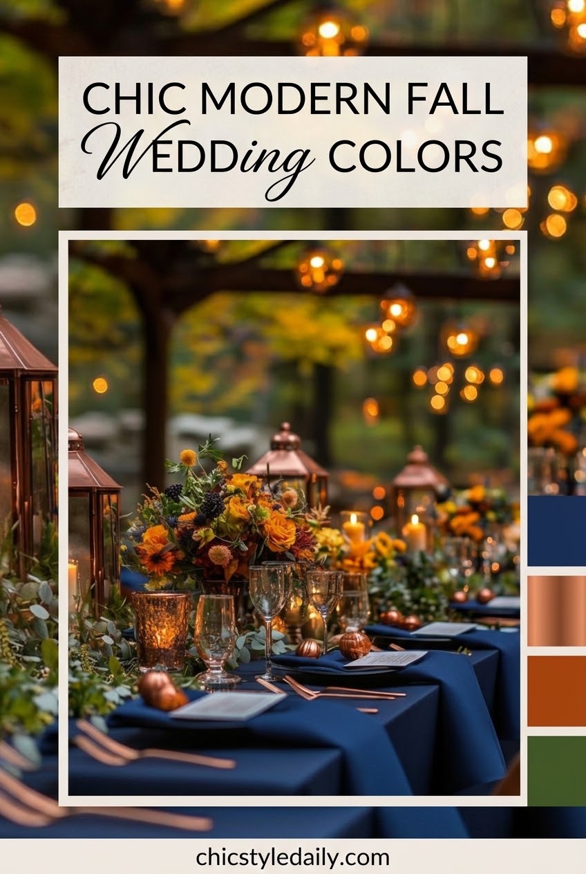
Navy and copper is a great option for couples who want autumn warmth without using traditional fall shades. I love the way copper accents brighten navy and keep the palette from feeling too formal.
This works beautifully with stationery, suits, glassware, and candle holders. It is also one of the easier combinations to reuse throughout your home after the wedding.
Plum & Mauve
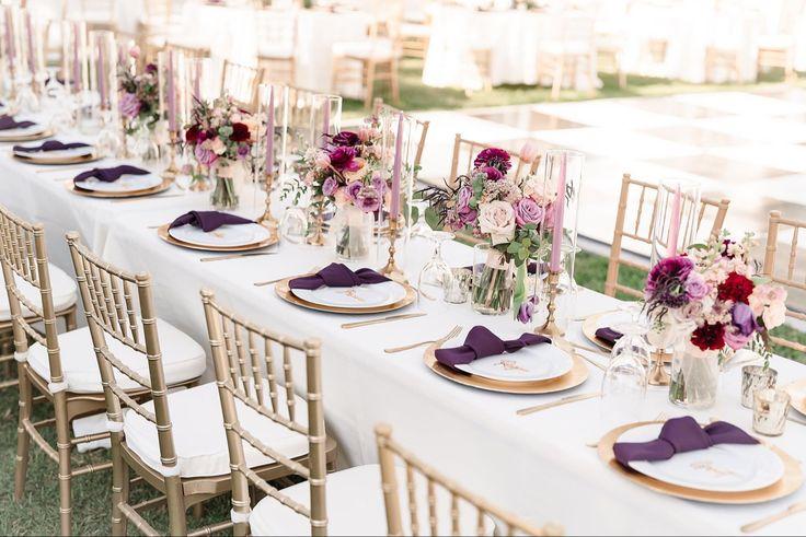
Plum and mauve gives fall weddings a softer, slightly vintage direction. The palette feels especially pretty in photographs because muted purple tones blend naturally with autumn shadows.
I would avoid adding too many competing jewel tones here. Let the plum carry the drama and keep the supporting colours quiet.
Sage Green & Cream
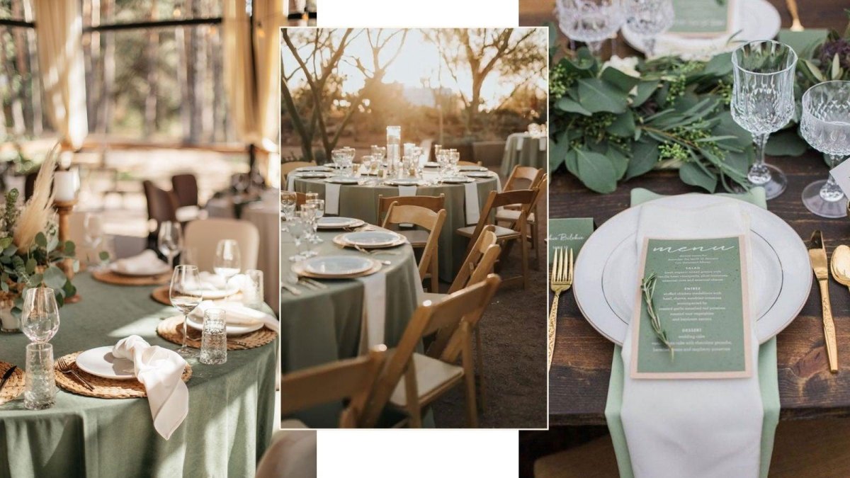
Sage green and cream is the calm friend of the fall wedding world. It creates a natural look that feels modern because of its clean neutral foundation.
This palette is practical too. Greenery often gives you more flexibility with floral costs, and cream works across dresses, linens, and stationery.
Black & Warm Neutrals
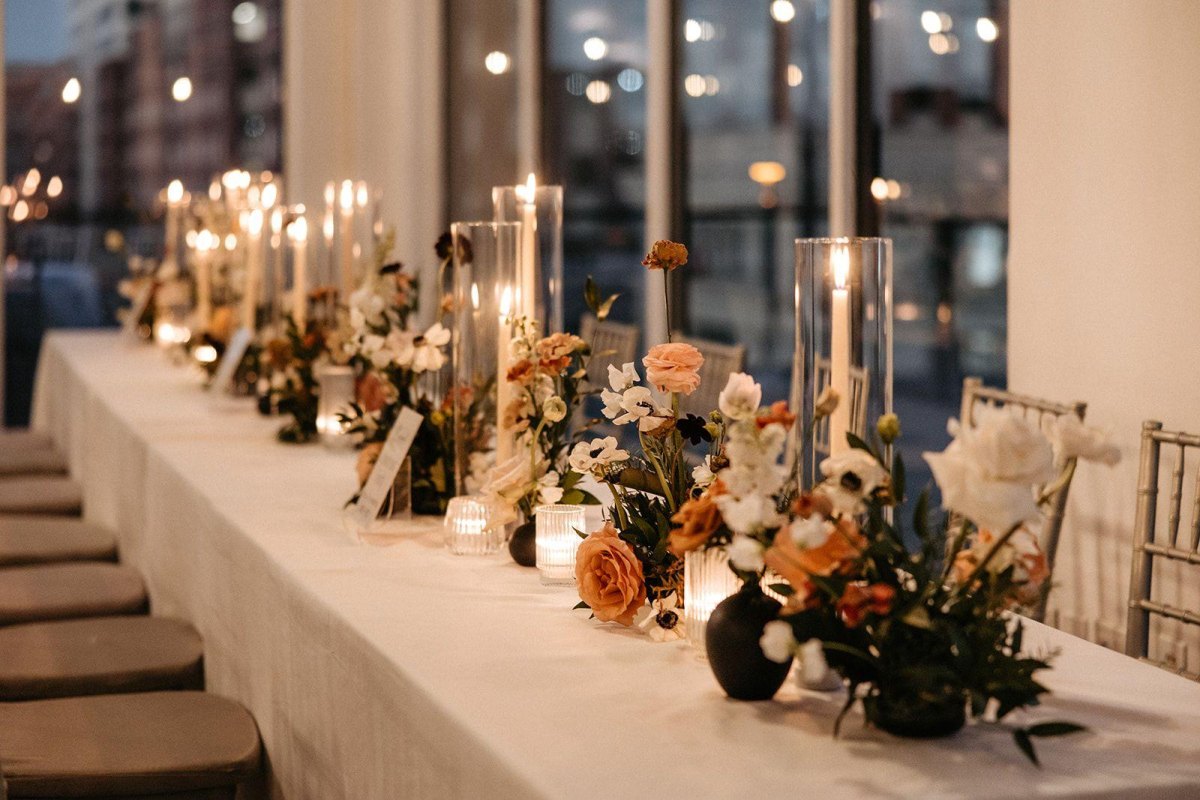
Black with warm neutrals is for couples who want a fashion-forward reception. I love this because modern black wedding styling can feel editorial rather than harsh when softened with beige, taupe, or wood textures.
The trick is adding warmth through materials. Matte ceramics, natural linen, and candlelight stop black from taking over the room.
Rust Orange & Camel
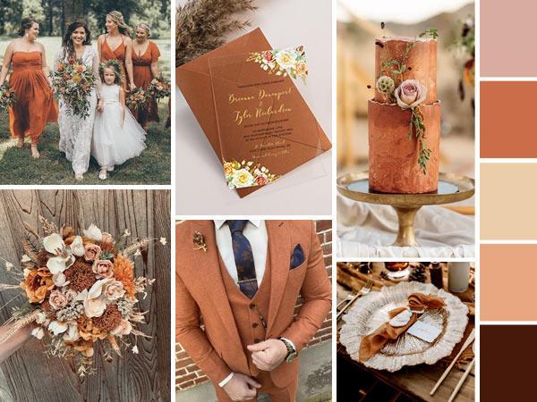
Rust orange and camel is a very wearable autumn palette. It reminds me of a great copper hair colour: warm, noticeable, and beautiful when it suits the setting. The key is keeping rust tones sophisticated with elevated fabrics.
Choose one strong orange element and let camel, cream, or brown support it instead of competing.
Chocolate Brown & Champagne
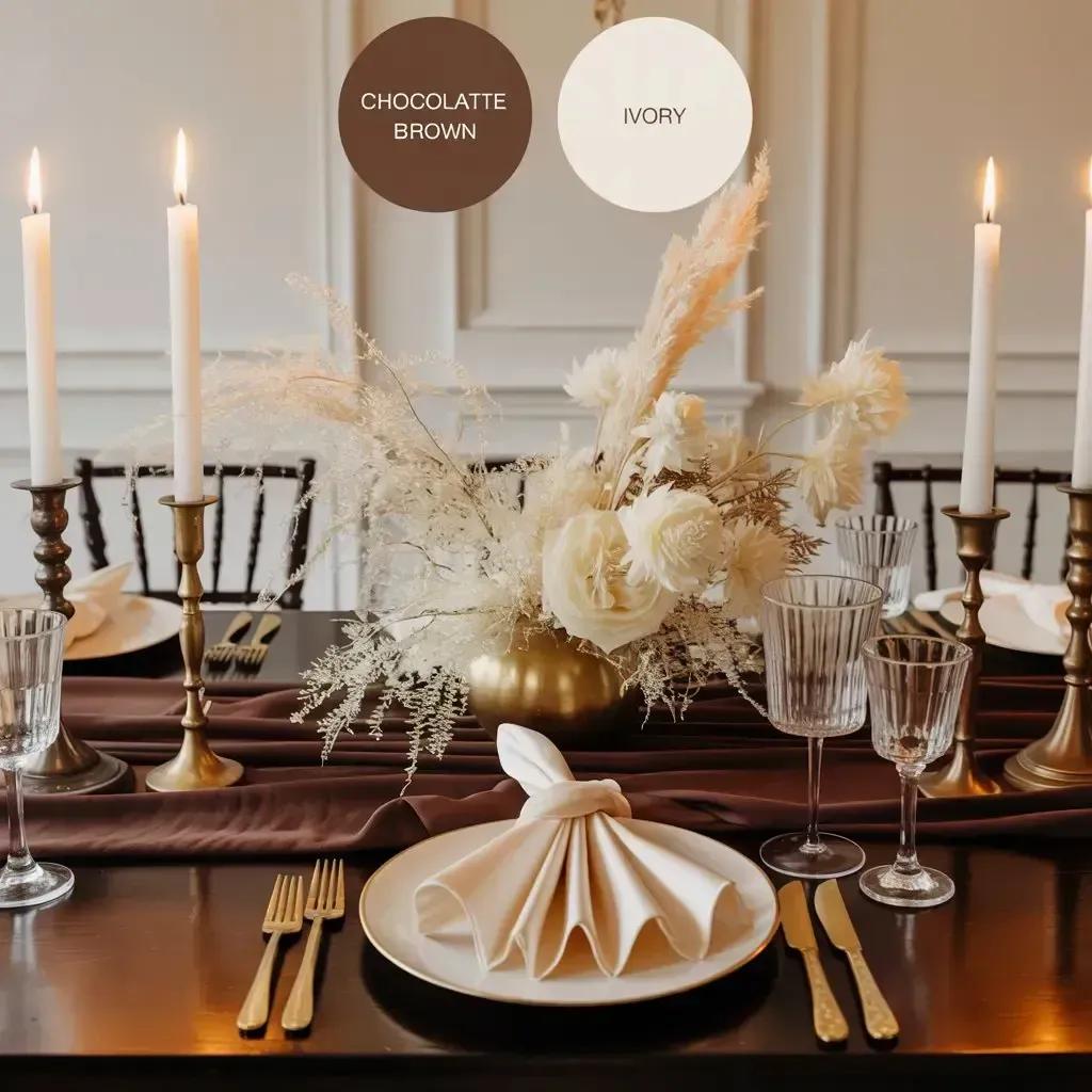
Chocolate brown is having a moment because couples are moving toward warmer neutrals. Combined with champagne, it creates luxury autumn warmth without feeling overly traditional.
I especially like this palette for wood-heavy venues where the colours already exist in the surroundings.
Olive Green & Burnt Orange
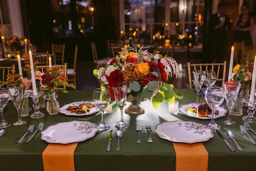
Olive green and burnt orange brings in the outdoors while keeping the look polished. It is a strong choice for couples who love earth-inspired wedding palettes.
This pairing works beautifully with textured florals, but I would keep the stationery simple so the colours remain the focus.
Deep Teal & Amber
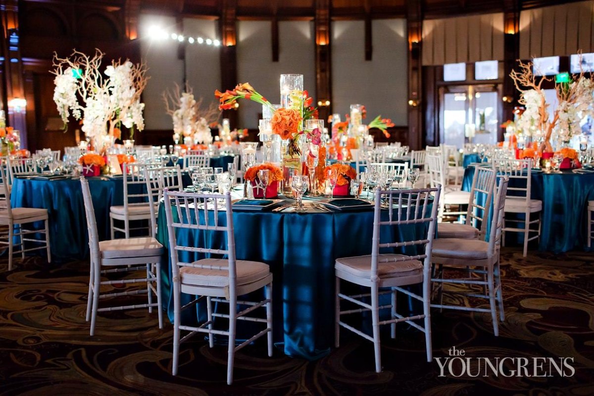
Deep teal and amber is one of my favourite unexpected fall combinations. The contrast feels creative because blue-green wedding tones bring freshness to a season usually filled with reds and browns.
Amber lighting is especially important here because it connects the cool teal with the warmth of autumn.
Wine Red & Peach
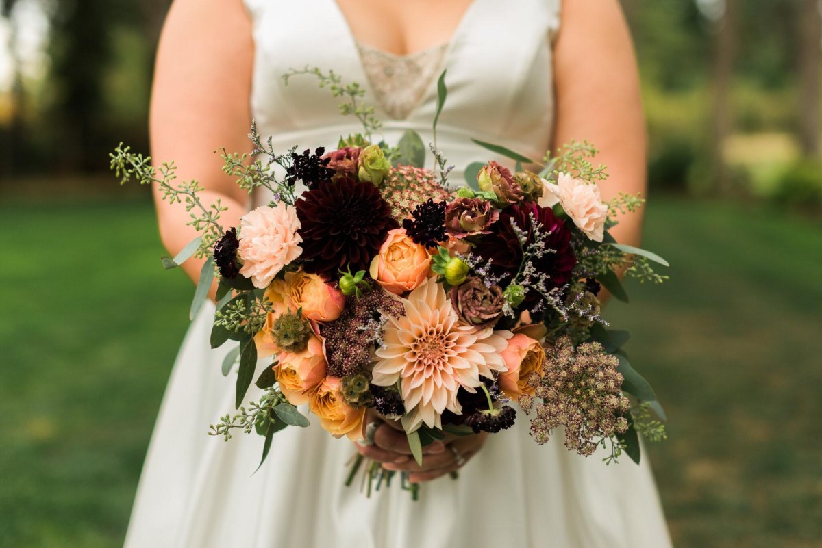
Wine red and peach gives a romantic fall feeling without becoming too dark. I like how peach softens rich red and creates a more relaxed celebration style.
This palette is lovely for outdoor weddings because it works with changing leaves and golden-hour photography.
Mocha & Latte
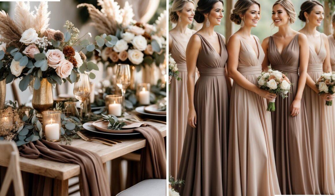
Mocha and latte shades are perfect for couples drawn to coffee-inspired neutrals. This palette creates modern monochromatic warmth through different brown tones.
The secret is variation. Mix fabrics and textures so the colours do not flatten into one beige block.
Forest Green & Velvet
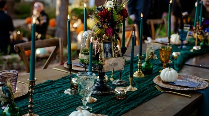
Forest green and velvet feels dramatic in the best way. I love this pairing for evening weddings because velvet autumn texture instantly adds depth.
Use velvet selectively in runners, chairs, or ribbons. A little goes a long way with this fabric.
Charcoal Gray & Berry
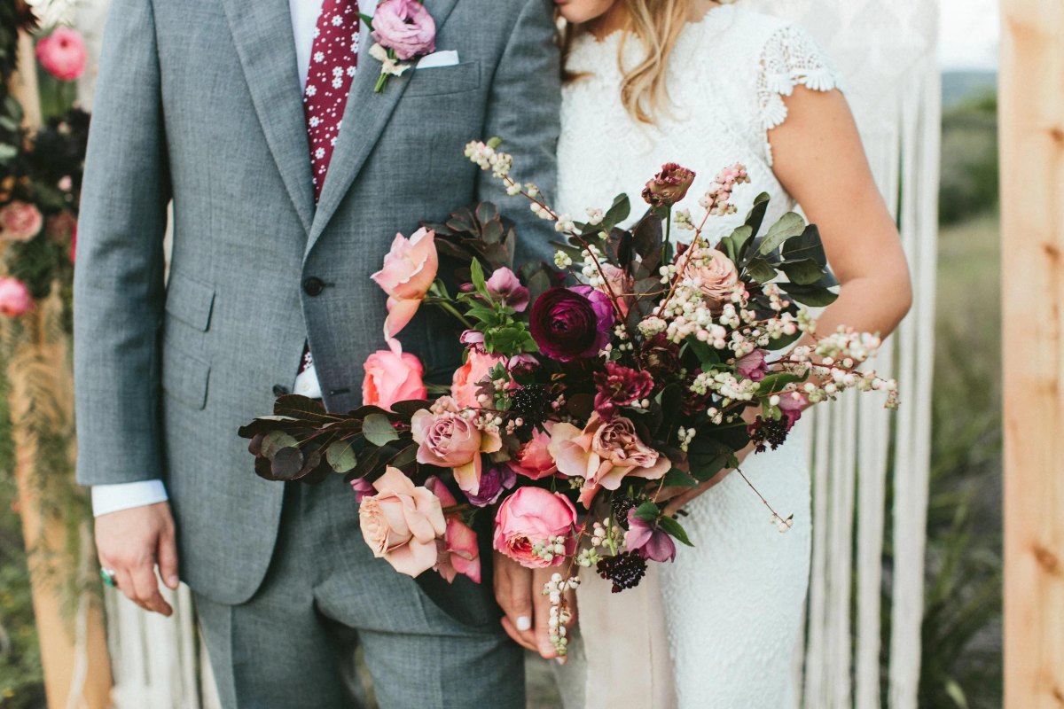
Charcoal gray and berry is a modern alternative to black and red. It feels sophisticated because soft gray balances berry tones and keeps the palette wearable.
This combination also photographs beautifully with suits, stationery, and floral arrangements.
Antique Gold & Burgundy
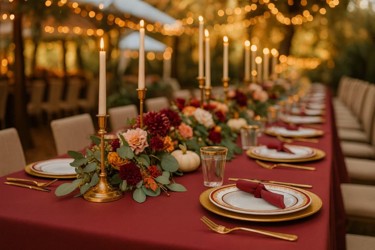
Antique gold and burgundy gives a classic autumn wedding a richer update. I like it when couples want old-world inspired details without making the whole event feel formal.
Choose aged gold finishes instead of shiny metallics for a more modern result.
Copper & Eucalyptus
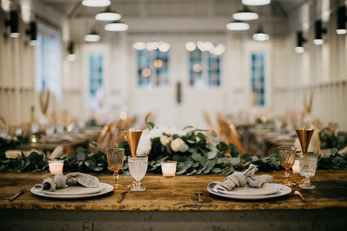
Copper and eucalyptus is a softer metallic pairing that feels natural and current. The greenery keeps copper wedding accents grounded instead of overly glamorous.
This works particularly well for outdoor venues, farm settings, and relaxed celebrations.
Modern Minimal
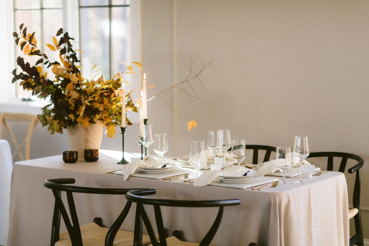
Modern minimal fall weddings prove that autumn does not need a long colour list. A restrained palette of neutrals with one seasonal accent creates intentional wedding design.
My favourite versions use fewer elements but better ones: beautiful lighting, quality fabrics, and details guests actually notice.
More Pinterest Visuals